Microsoft - Bing
As part of the Bing Maps team, I have worked closely on:
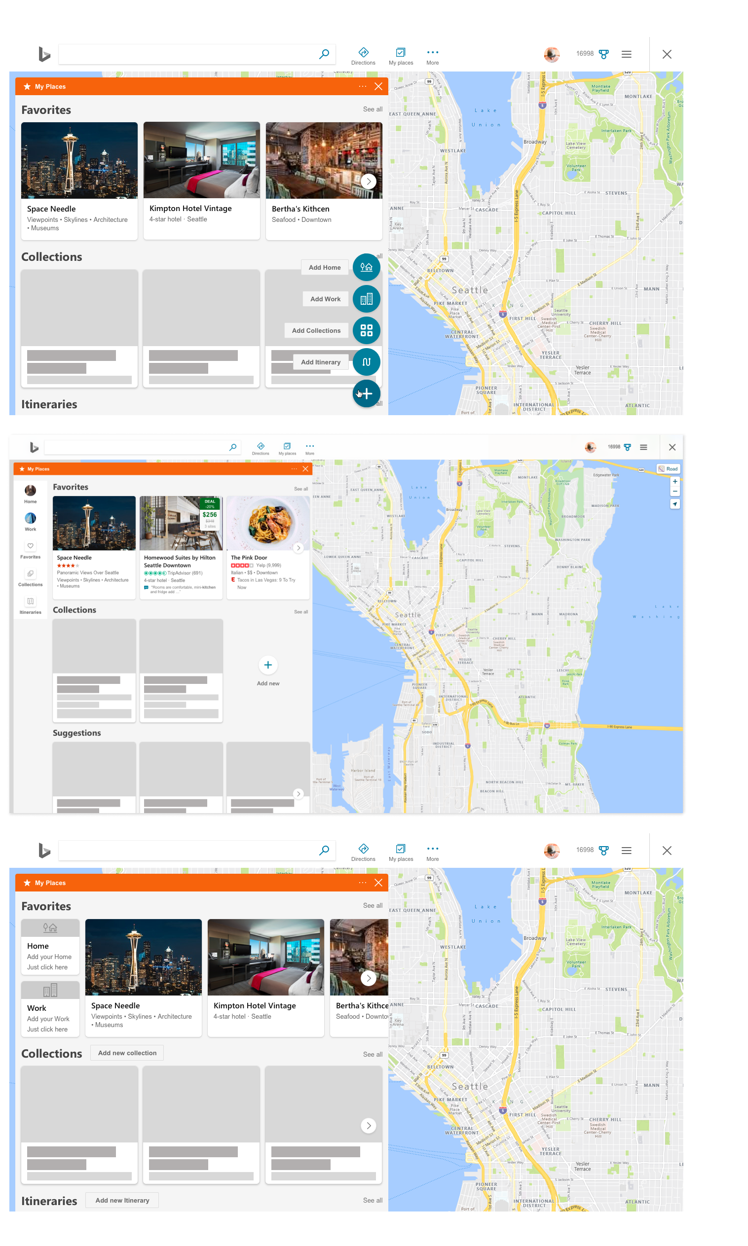
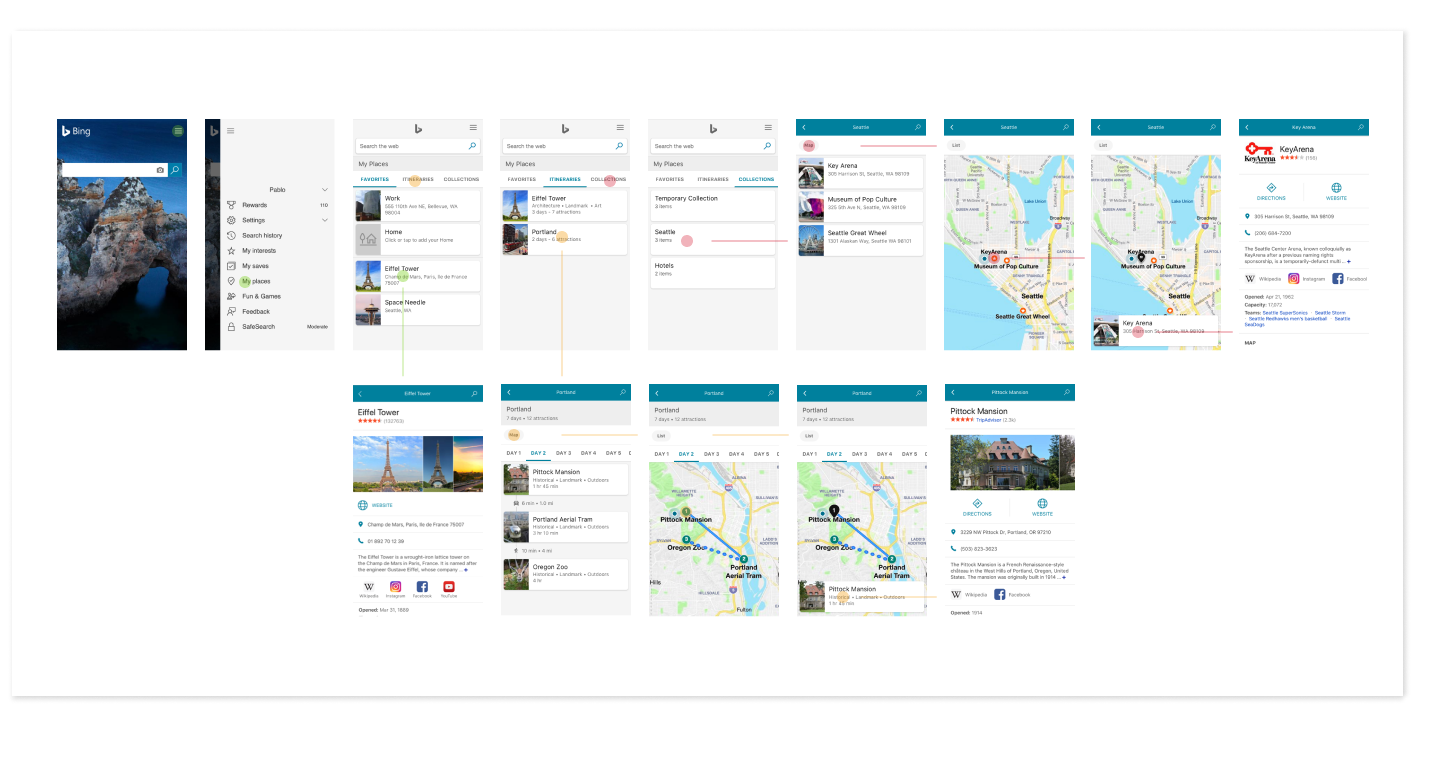
My Places
My Places
What is Bing My Places?
Bing My Places is a product that allows users to save places or locations they search for on Bing Maps. Within My Places, users can create custom collections and itineraries to share them with family, friends, coworkers, or anyone they choose. Users can save places into collections from the search results or by right-clicking directly on the map, making organization streamlined and efficient.
Challenge
To improve the current experience of searching for, organizing, and sharing collections of places using Bing Maps and My Places. This includes refreshing the interface for desktop and mobile devices, ensuring users can easily access their saved places on any platform and maintaining required structural elements.
My Role
Work with product managers to clarify business goals
UX flows and wireframes
UI and interaction design
Prototyping
Present designs to stakeholders
Align all explorations to the Bing Design System
Work with UX writing team on all UI text inputs to ensure accessibility
Refine designs and export redlines for development
Communicate with development regarding design edits, refinements, and flight checks
Analysis
My analysis included a study about the current experience including: the user journey, how each element was connected, current entry points and what competitors are doing. This helped me to identify what was working well and pain points.
Some results from my analysis include:
Innacurate results when users add Home/Work;
Poor interface, icons, accesibility and quality of data;
Lack of results.
Wireframes & Explorations
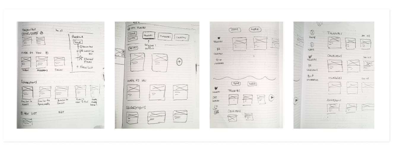
Explorations included different approaches with different models. I tried several iterations to ensure the user experience made sense and aligned with the style being used on other key surfaces on the map.
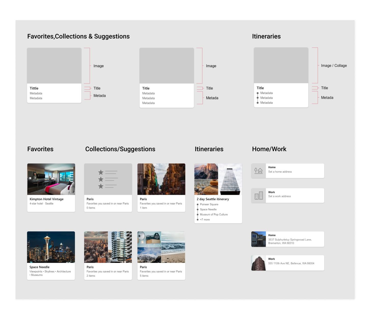
Card Structure
My Places contains entities of multiple types, it is easier to scan if there is a consistent pattern to key metadata (e.g. name/nickname, general location).
Some metadata is more important before selecting what to save than after. We don’t need to show it (e.g. reviews).
Only show metadata that clearly improves the experiences of recalling saved items.
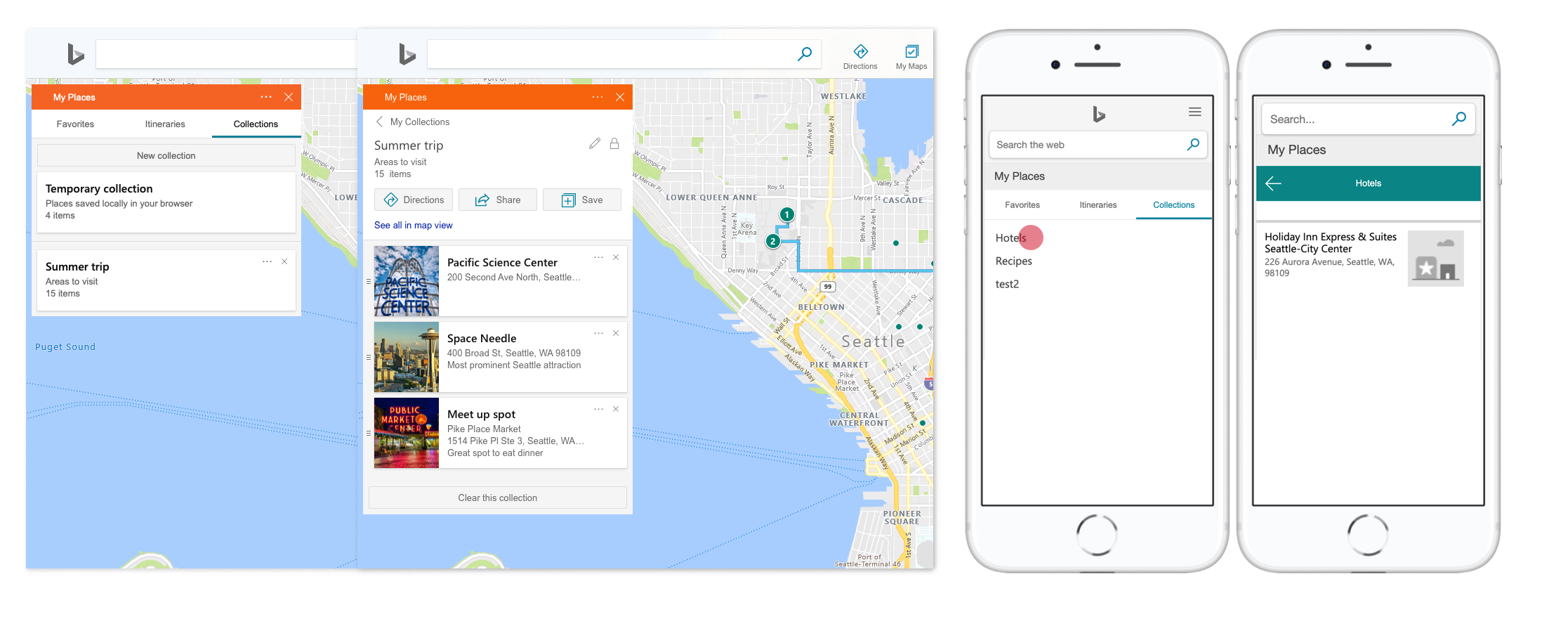
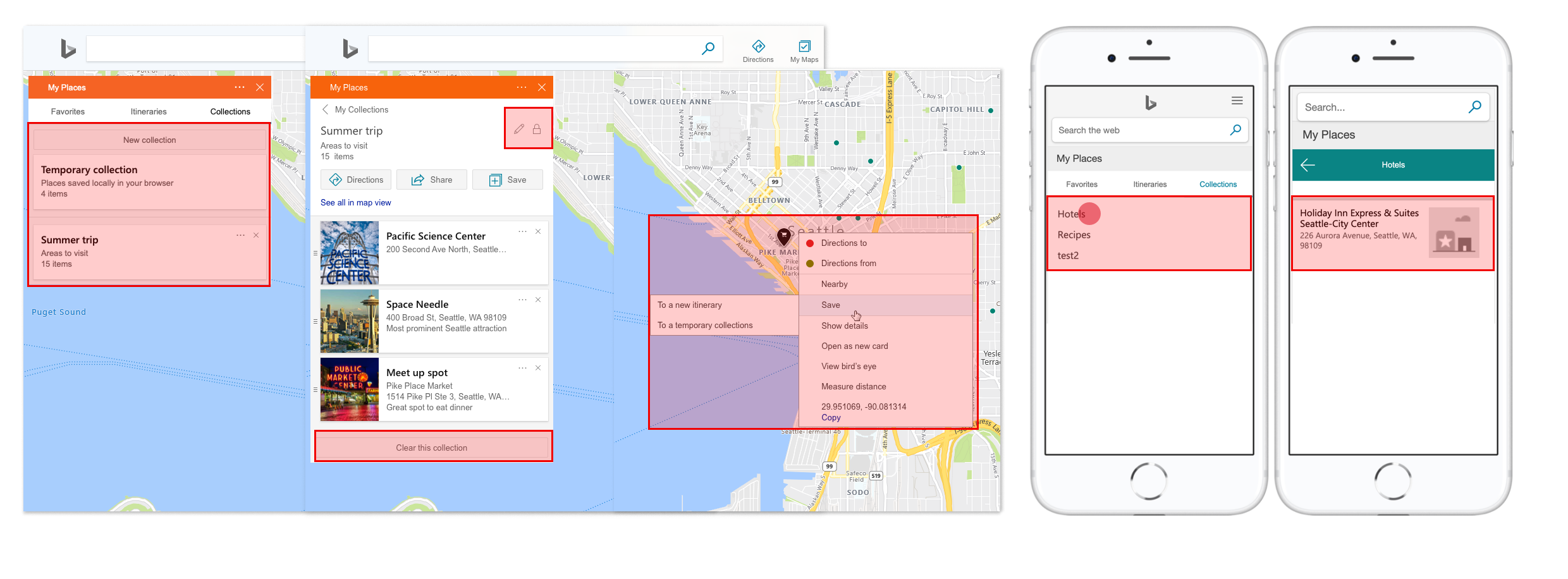
FINAL DESIGN - DESKTOP
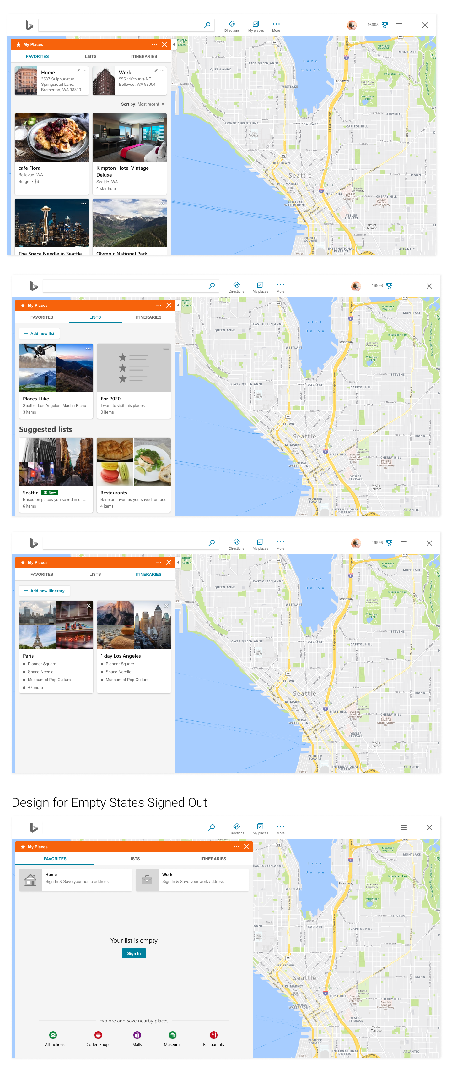
FINAL DESIGN - MOBILE
GOALS
• Increase user engagement;
• Allow users to quickly find their saved places;
• Provide additional value for using My Places as an organization and planning tool;
• Support users’ ability to organize their saved places by creating auto-collections;
• Align My Places UX with the style being used on other key surfaces on Bing Maps
• Increased user satisfaction
CONCLUSION
The new My Places design was flighted and tested over a span of three weeks. In that time, unique user engagement increased by 8%.
Ads for Point Of Interest (POI)
Ads for Point Of Interest (POI)
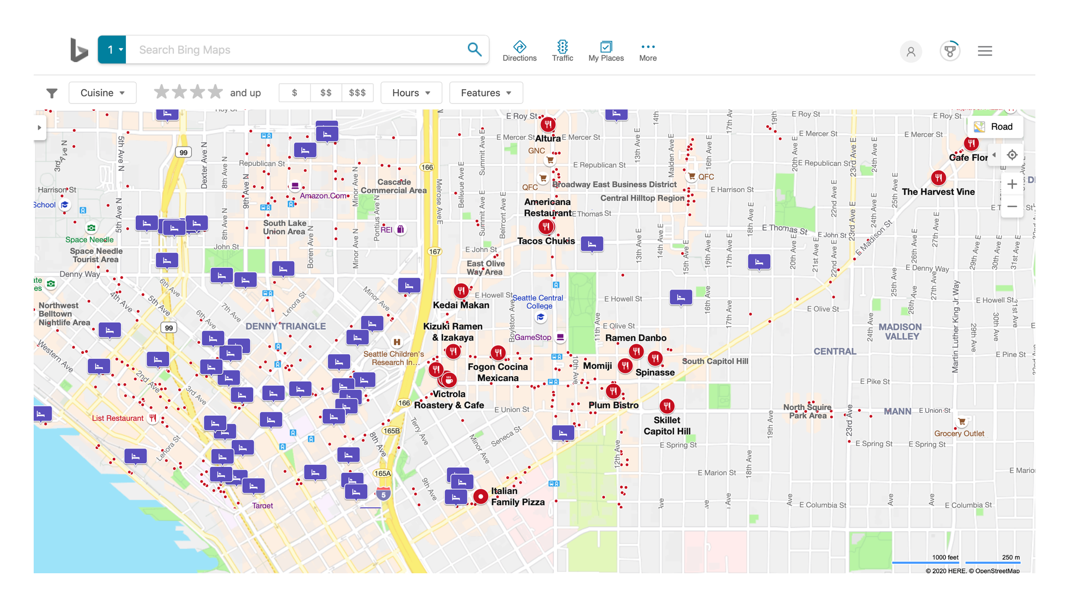
What is a POI on Bing Maps?
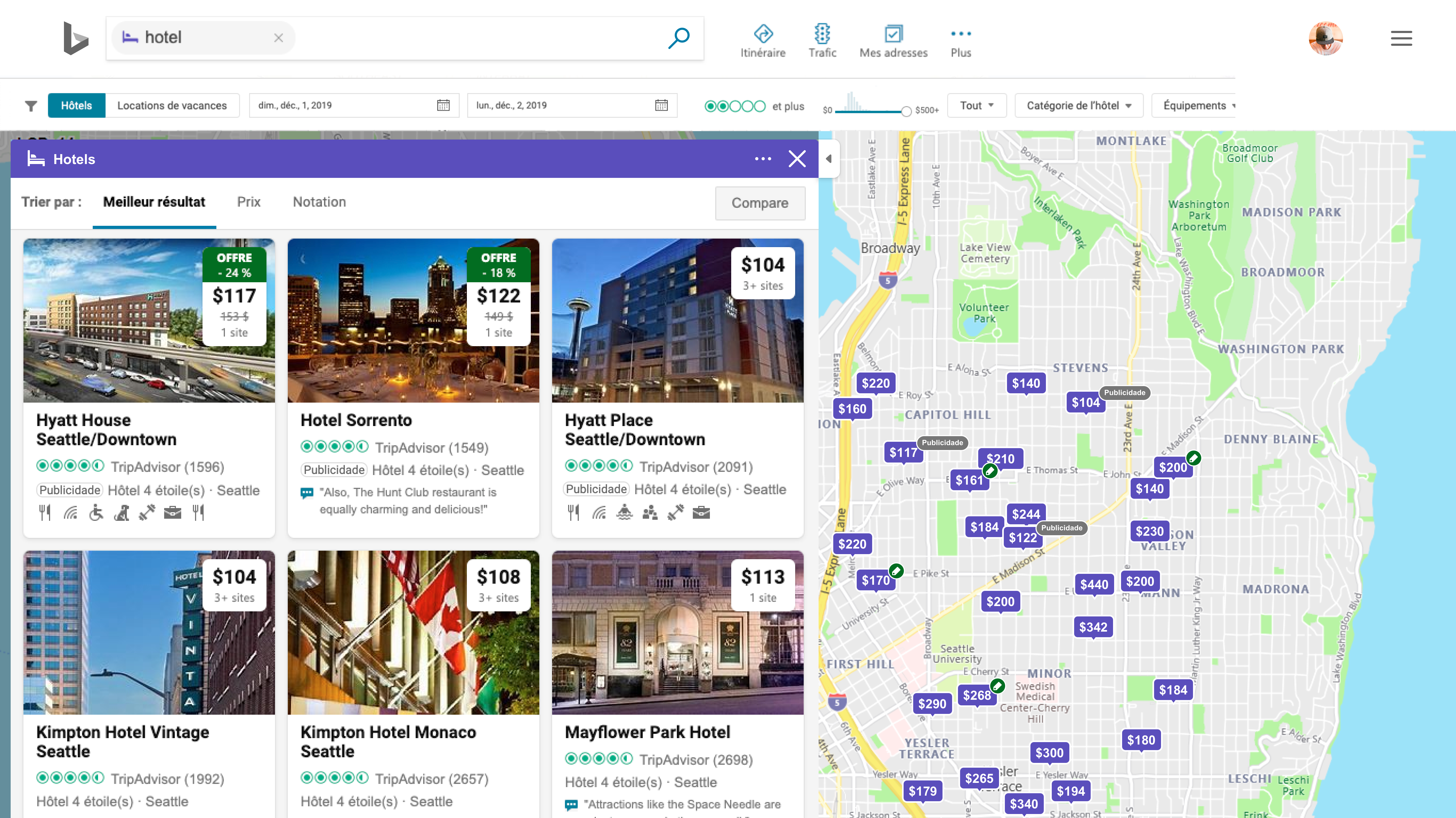
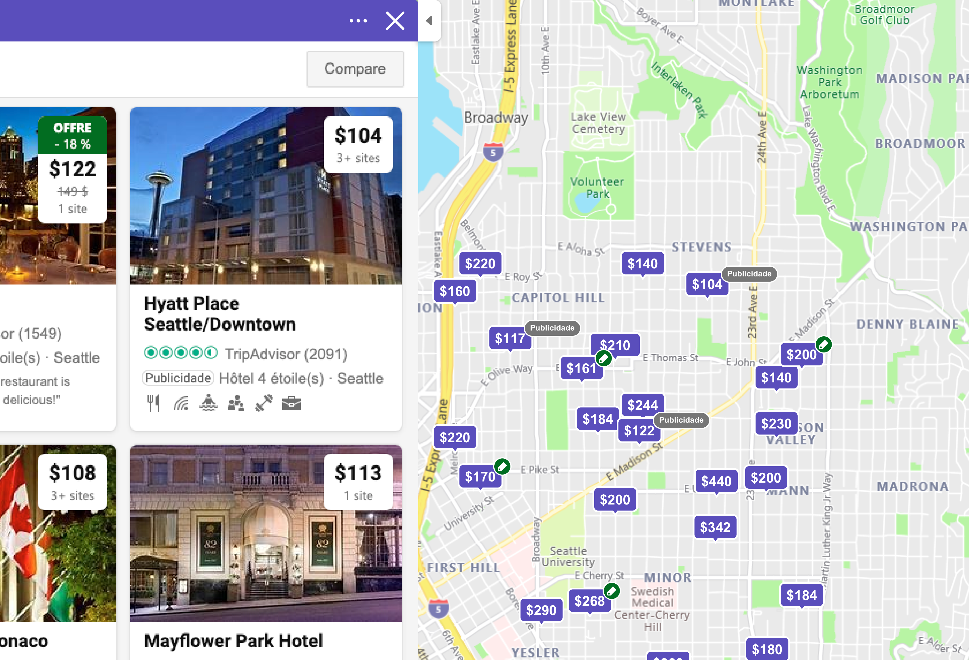
A Point Of Interest (POI) contains information about a specific place or entity on Bing Maps and is represented with different icons depending on the entity type (Restaurants, Attractions, Hotels, etc).
Challenge
Visual representation for the Ads POIs on Bing Maps that is scalable accross all markets for all entity types maintaining required structural elements.
Current Badge System
My Role
Work with product managers and other designer to clarify business goals
Research
UI
Present designs to stakeholders
Align all explorations to the Bing Design System
Refine designs and export redlines for development
Analysis
My analysis included a study about the current badge system, different languages used accross the world and how others solve similar problems.
Different Approaches
I tried different approaches with different models. I tried several iterations to ensure the user experience made sense and aligned with the style being used on other key surfaces on the map.
Possible Approaches
We explored a couple of potential directions and narrowed down as some approaches did not work within our context.
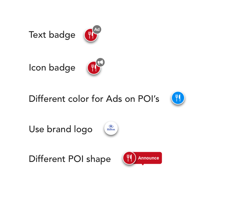
Direction further explored
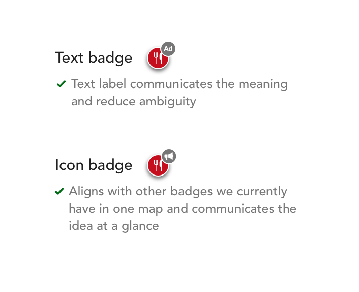
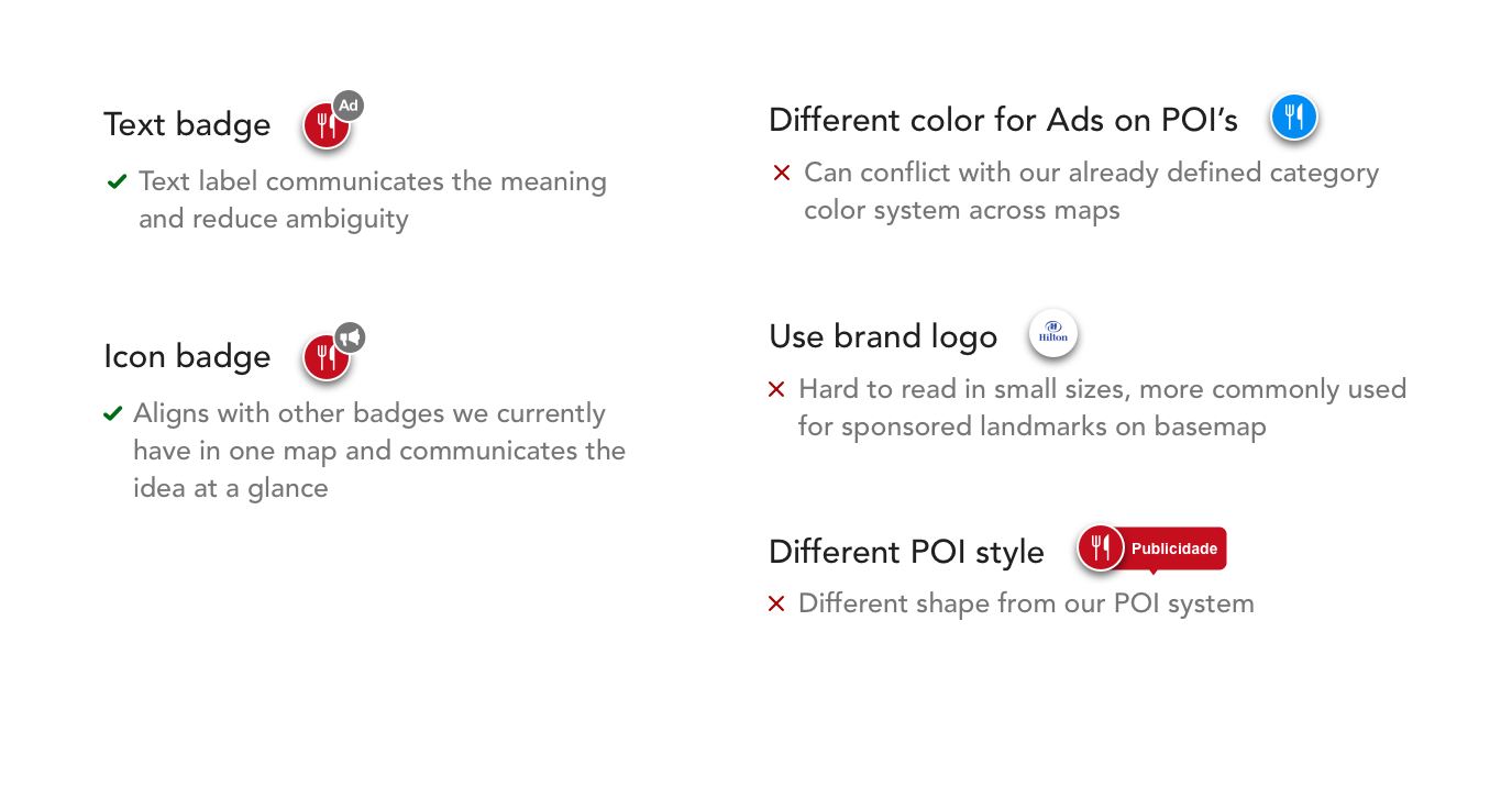
Further explorations using text and icon badge concept
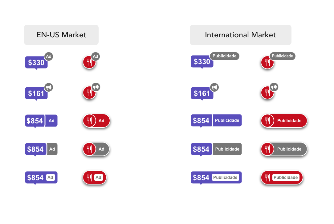
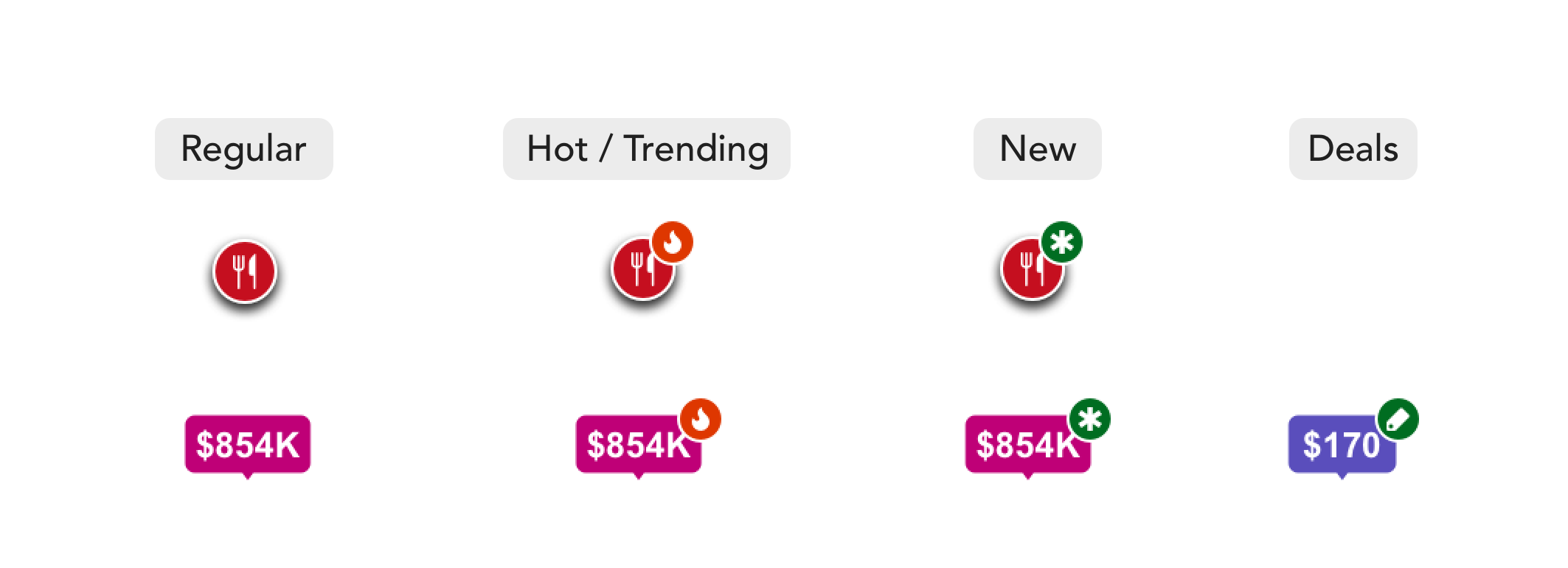
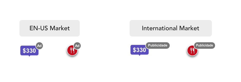
Final Design
We decided to show text in the badge on the top right because it's clearly understandable without additional effort. The badge can look long in certain languages, but compared to the other approaches that have some concerns, this option works better. The badge can look long in certain languages, but since there will not be a lot of ads POIs on the map at a time, this is the best solution.
Goals
• Ads POI is lightweight, non-obtrusive to map experience
• Scales to different types of POIs (hotels, restaurants, etc)
• It works for all markets
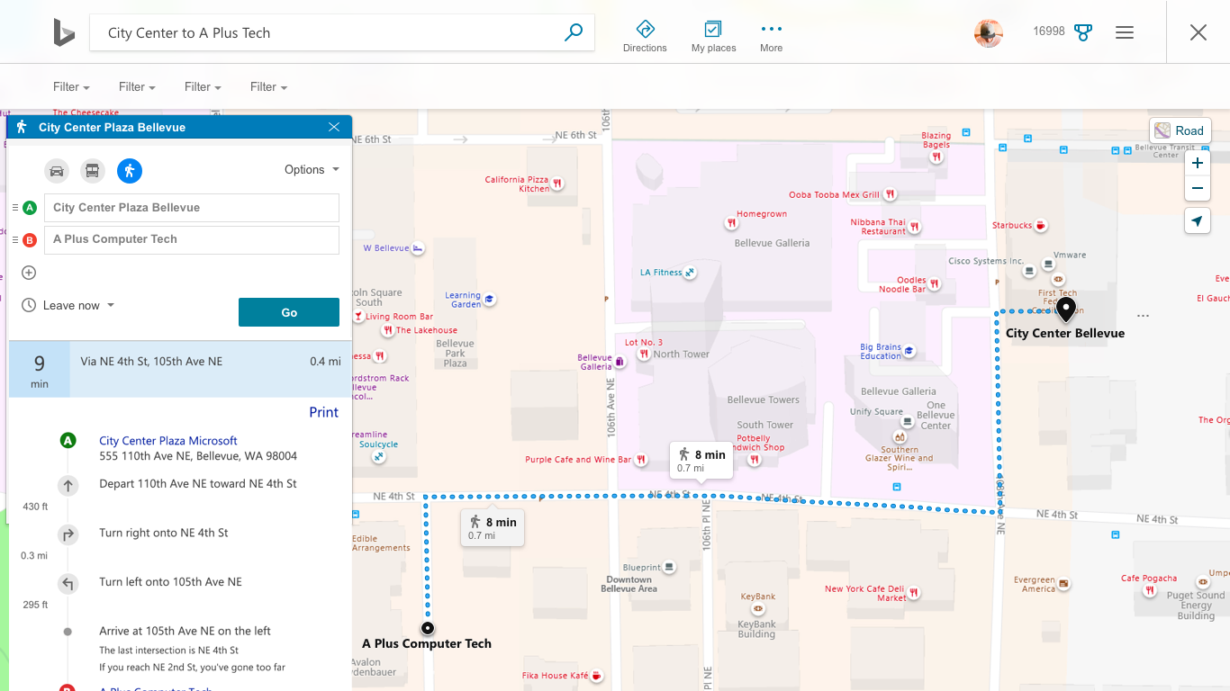
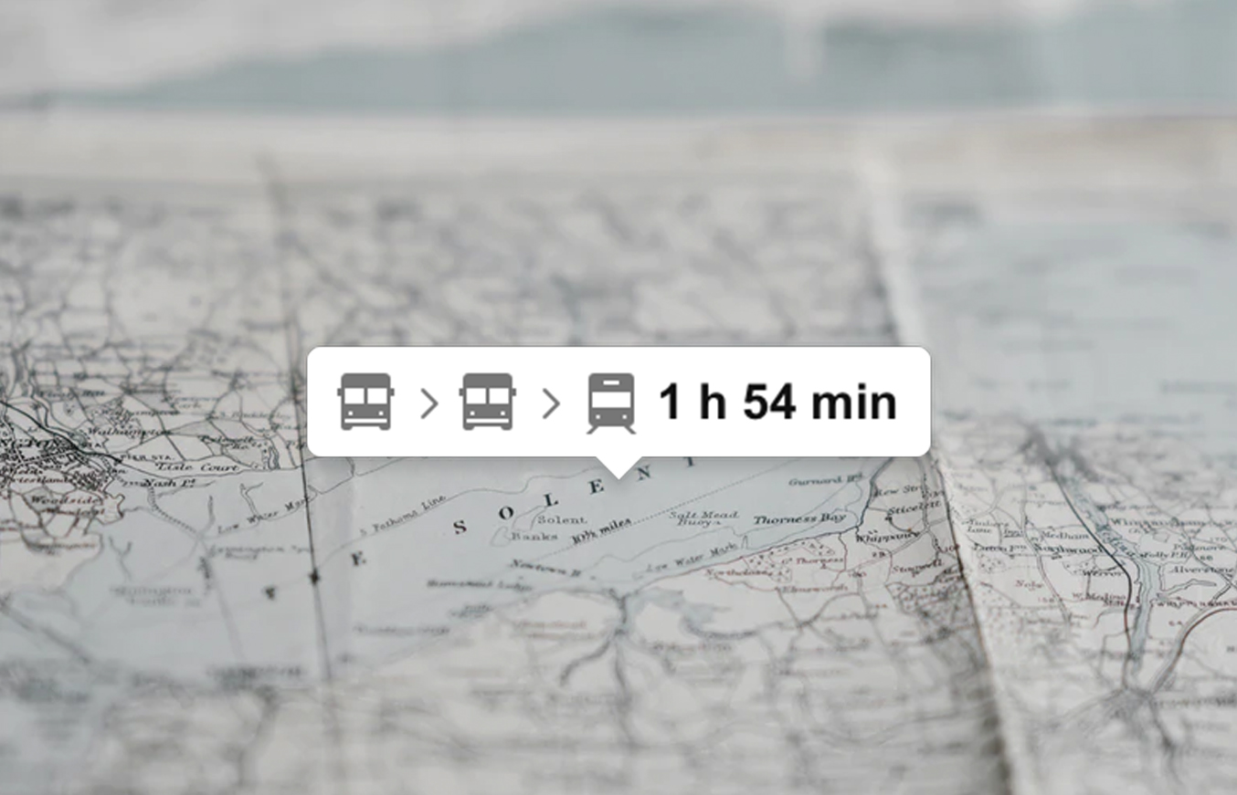
Directions Answer
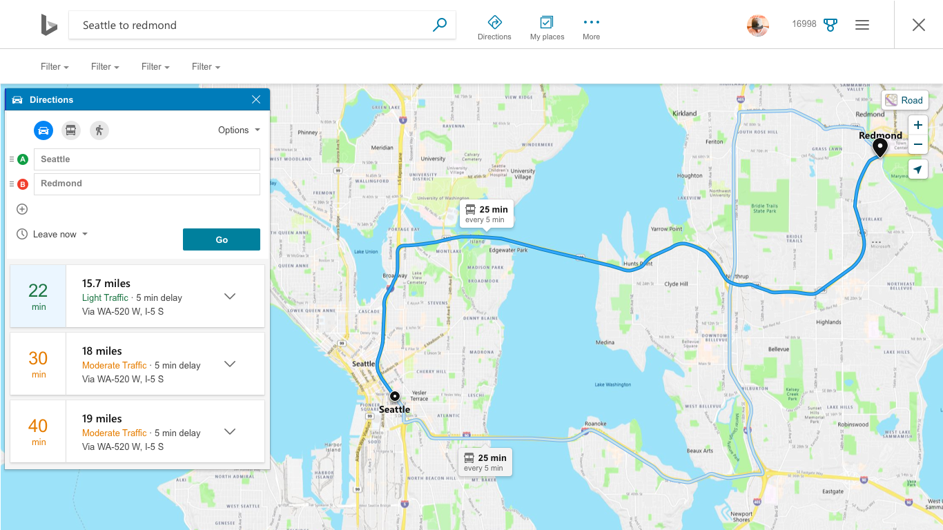
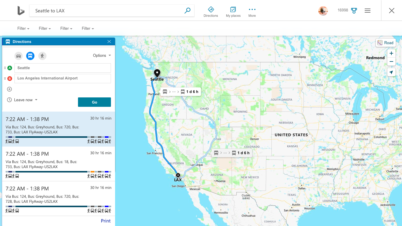
Directions Answer
Goals
• Editable source and destination;
• Users ability to select the time when using transit;
• Visual refresh
This re-design is currently in production and under NDA. More updates will be made to this case study once this feature has shipped.
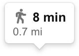
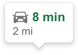
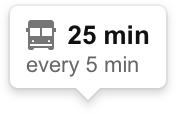
Route Info Pin
Route Info Pin
Goals
• Show important information on map such as: estimated time, mode of transportantion and estimate time for alternative route;
• Identify by color the traffic on a route.